Loading page…
Digital media
ApexTelemetry — A React-Based F1 Analytics & Telemetry Dashboard
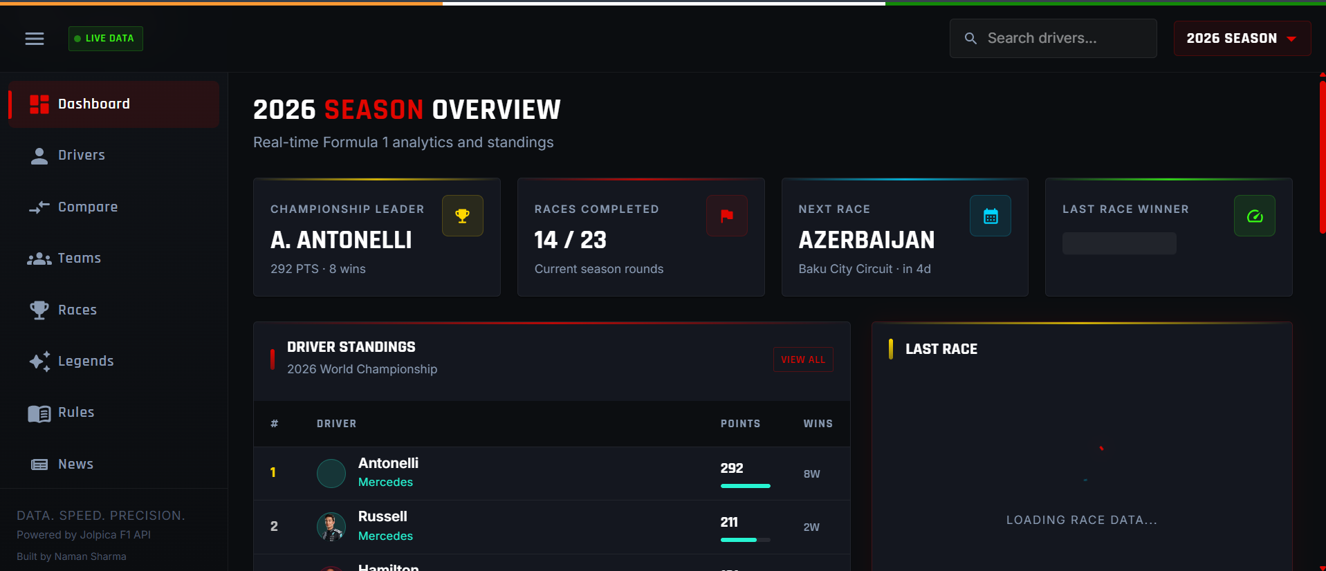
Apex Telemetry Media wanted a way to turn raw Formula 1 data into visual, easy-to-digest content for their fan audience — race results, driver stats, and telemetry breakdowns that go beyond what official broadcasts show. ApexTelemetry was built as a single-page React application that pulls historical race and telemetry data and presents it through interactive charts and comparison views, giving the audience a "team analyst" view of the sport.
- Client
- Apex Telemetry Media
- Industry
- Motorsport Media & Sports Analytics
- Technologies
- Javascript
The challenge
F1 data (results, lap times, telemetry) is spread across multiple sources and formats, making it hard to present cleanly without heavy backend processing.
Non-technical fans needed complex data (throttle/brake/speed traces, sector deltas) presented visually rather than as raw numbers.
Comparing multiple drivers, laps, or seasons side-by-side required a UI that stays clear and fast even as chart complexity grows.
Rendering large telemetry datasets (thousands of data points per lap) without hurting page performance.
Solution
What we built
Built a single-page application in React.js with a component-based architecture, so each analytics view (race results, driver comparison, telemetry charts) is modular and reusable.
Integrated the Ergast API for historical race, qualifying, and driver/constructor data, and OpenF1 for telemetry (speed, throttle, brake, gear).
Used a charting library to render interactive line/bar charts for lap comparisons, sector deltas, and telemetry overlays, so fans can visually compare drivers on the same graph.
Designed a clean, dashboard-style UI so a casual fan can explore stats without needing racing-engineer knowledge.
Optimized data fetching and rendering to keep charts responsive even with multi-season or multi-driver datasets.
Technologies used
- Javascript